

There’s not often a lot of “synergy” between what’s trending on TikTok and the more self-serious parts of the interior design world. These trends often feel kitschy or cute, meant to shake things up for a time but ultimately to die out as quickly as they sparked up.
Where fashion seems to take reaches and risks for trends that feel out of the box, interior design feels — for good reason — more restrained, slower to make wholesale changes, and calculated about what the collective tastemakers “allow” into their space.
But a recent theory-turned-trend has had a lot of people — us included — taking note. Coined by TikTokker, Taylor Migliazzo Simon, “The Unexpected Red Theory” asserts that adding red where it shouldn’t be pulls everything in a space together.
Whether Taylor realized it or not when she said it, this concept has legitimate roots in fashion, where red heels, a red lip, or other red accessories are often used not as matching or coordinating fixtures in an outfit, but rather as stand-alone, contrasting statements that serve to bring an entire look together. We’re big believers that personal style is the most natural indicator of interior design taste, so it makes sense that an idea long-embraced in fashion would lend itself to being transposed into our spaces.
Taylor goes on in her video to joke that she’s petitioning to make red a “neutral” color because of how seamlessly it pairs both with washed-out teals and bold, saturated purples. She highlights a cherry red floor in a kitchen of sandy beige cabinetry and pale appliances, bold crimson, free-standing sinks in a dark, slate-blue bathroom, a large, orange-y red painting in a monochromatic purple hallway, a bright red lamp in a living space filled with earth tones across a canvas of greyish-blue before landing on an idea that — like Taylor — may be our two favorites: a mirror and painting both adorned with beat red frames.
There’s something to this idea of treating an otherwise abrupt or disruptive color as a neutral. Rather than viewing red as some kind of massive distraction, maybe we should see it as the key to bringing things to life. Red can be the romantic, levity-adding trim that your dark and mundane swatch needs, or the contrast your neutrals stand against in order to feel as relaxing as they should, or the moodiness to keep bright colors from feeling to silly or childish. It can work in so many ways, if only we view such a contrast as a tool, and not a distraction — by standing out, red serves a purpose that few other colors truly can by giving the “blandness” of neutrality a purpose!
This is weirdly how life works. Good coexists with bad, light with dark, and joy with grief. It’s these juxtaposed ideas that have to work in partnership to truly reveal their own purpose in our lives. As such, putting a “loud” color where it doesn’t belong adds balance in a way that our souls understand even if our minds wouldn’t inherently bend towards such a bold decision.
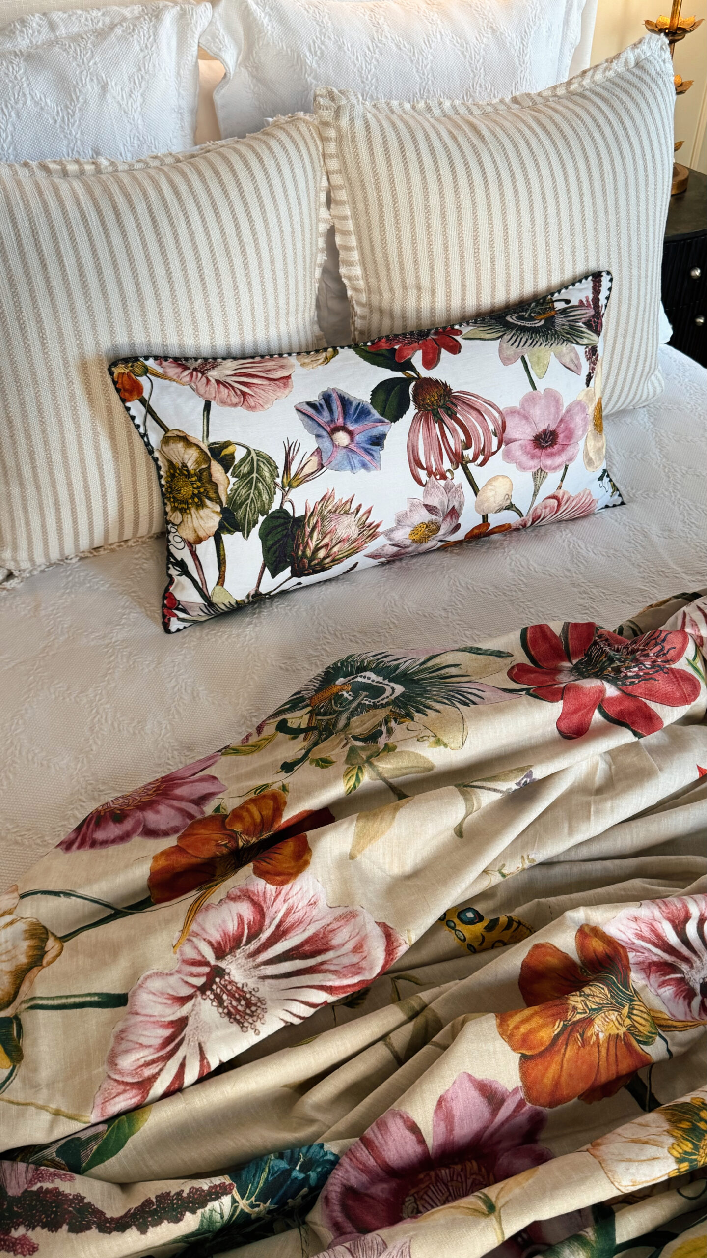
We recently added our own pop of unexpected red to our bedroom with this vibrant (yet not-too-loud) floral printed duvet cover. In a room with slate blue wall colors, copper curtains, and other moody hues, this subtle pop of red blends effortlessly into the color palette in ways we didn’t expect. Finding a simple way to add red into one space has us anxious to find our next application of The Unexpected Red Theory. Something about rebelling against your own color scheme really is as emotionally gratifying as it is satisfying from a design perspective!
In the end, this theory is about embracing the contrast we’re all more familiar with than we may even realize. Our world, and our lives are filled with contradictions that are as baffling as they are beautiful. An unorthodox pop of red tying our space together may be a fitting metaphor for finding peace in the midst of a storm, or learning how to love when we’re at our loneliest, or finding the key to generosity when we have the least.
Maybe The Unexpected Red Theory is a manifestation of the complexity of the human condition… or maybe it’s just a reminder that it’s okay to put that red lamp in your living room. Either way, we’re here for it.

It’s gorgeous! What brand is the diamond shaped leaf cover underneath the Anthropologie duvet you are featuring? It’s gorgeous, too! Thanks.