The better part of the last year has been a journey of do’s, don’t’s, “what was I thinking’s”, and “that’s not what that looked like online’s”. Needless to say, I’ve made some mistakes when it comes to designing my home. For every piece that magically pulled together a room, there’s five more that seem to haunt me, and, without fail, these failures always comes in the form of impatience.
When we decided to paint our main bedroom, I had been inspired by an image on Pinterest of grey walls and grey curtains — I absolutely loved that idea. That thought ignited the vision for this room, but the second I put the grey paint on the walls, I knew it wasn’t going to be exactly what I had in mind. I kept painting anyways… the result? The walls were too warm, the curtains were too cool and it just didn’t work the way I envisioned. But at this point I couldn’t admit defeat (and to be honest, I was tired, and we had just ordered Thai food to be delivered), so I just lived with it.
I was so anxious to have a room that felt “completed” that I completely missed out on having a room I was happy with! Sure enough, 8 months down the road, I really wanted to make this room a place I enjoyed spending my days and nights in–where I genuinely felt I could relax and find rest. I knew it needed to start where the original plan when wrong: the paint color. This room needed something calming but not boring, and I wanted it to flow nicely with the rest of the apartment.
I scheduled a Colour Consultancy with Farrow & Ball, because that’s where you start when you want to really nail the process of picking a color and painting a room. Before the consult, I had a vision starting to form and was pretty confident in what color I wanted to go with. I had a zoom call with Patrick from Farrow & Ball, and he looked at the room, the accessories, and he genuinely took time to understand my style. I told him my plans, even down to details about how natural light filled the room, and he gave me a few different color options (none of which were the ones I planned, which made me hesitant at first). But sometimes, even for me, I think it’s best to listen to the pros and I am SO glad I did. He chose one of the oldest Farrow & Ball colors: Light Blue.
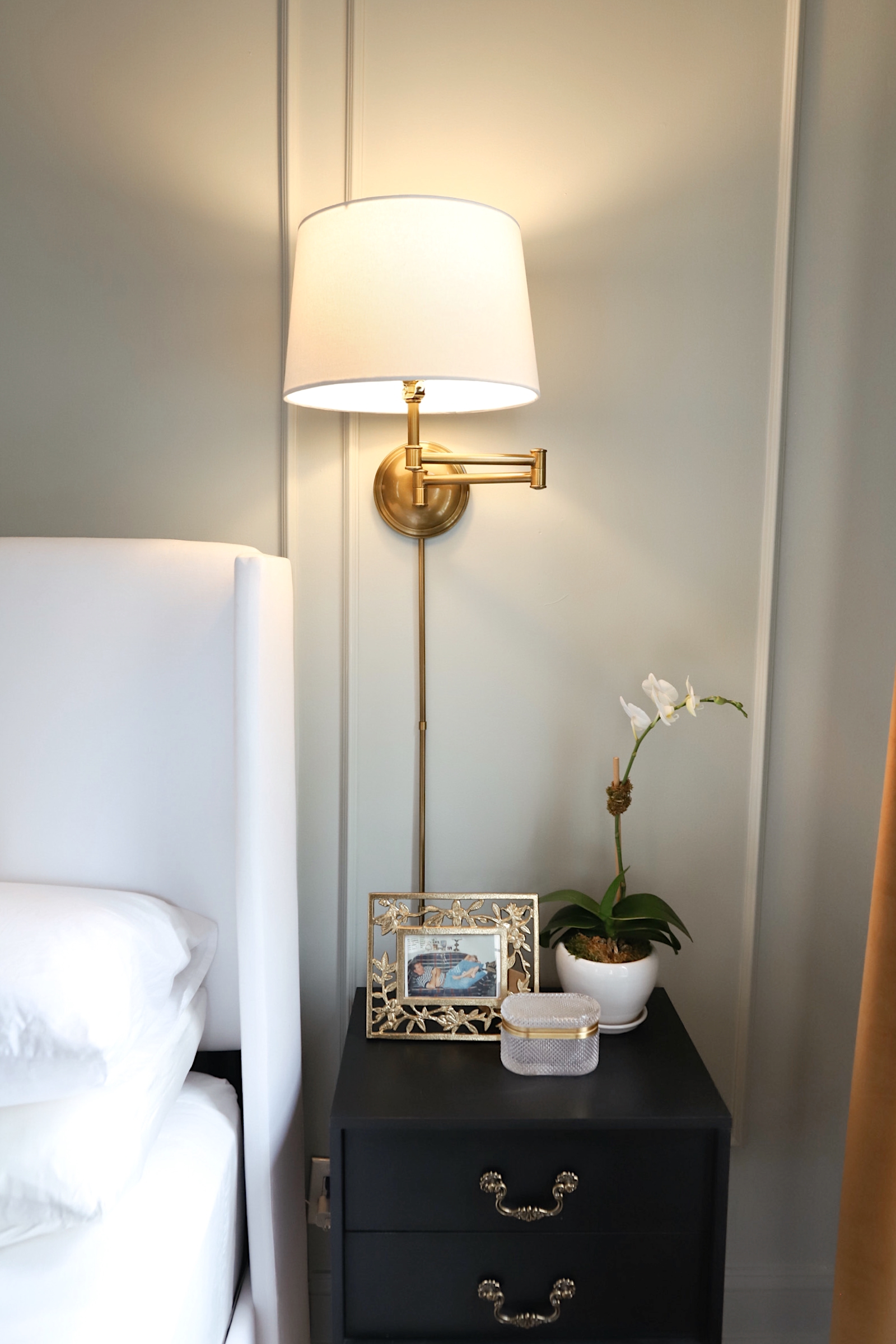
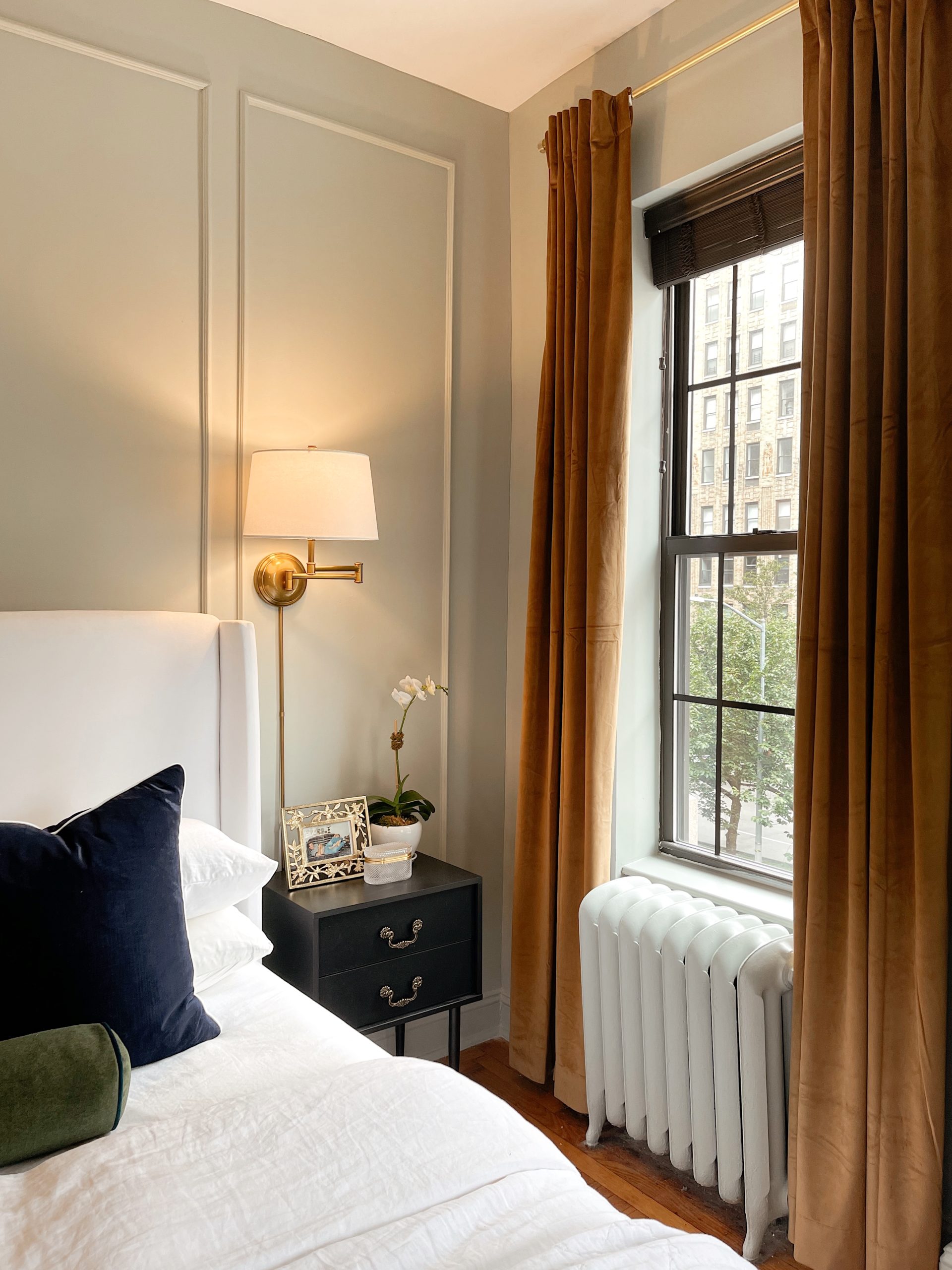
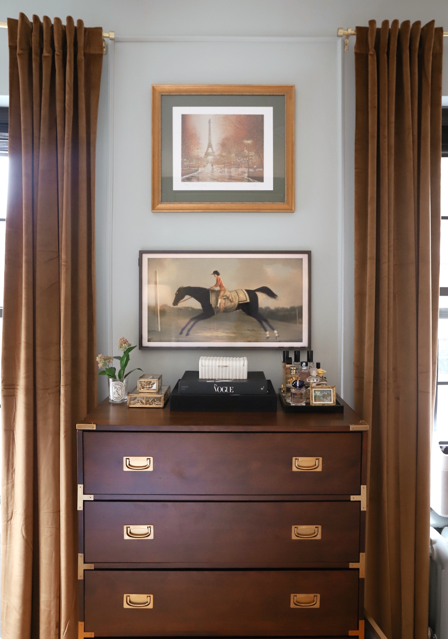
This color is STUNNING. We could’ve stopped with the walls, but I opted for a bit of extra drama by painting the trim and doors as well. The end product creates such a beautiful monochrome look. One of my favorite things about this color is that it truly looks different in every light and each corner. It has green undertones, which means I can pull blue and green in through accessories, and we LOVE to have options!
Patrick chose a couple of different finishes, and I’ll list those out below! Although this was my first experience using Farrow & Ball I can firmly say I’m a believer. There’s a noticeable difference in the quality of the paint as well as the pigment of the colors – I’m already scheming some paint options for our office!
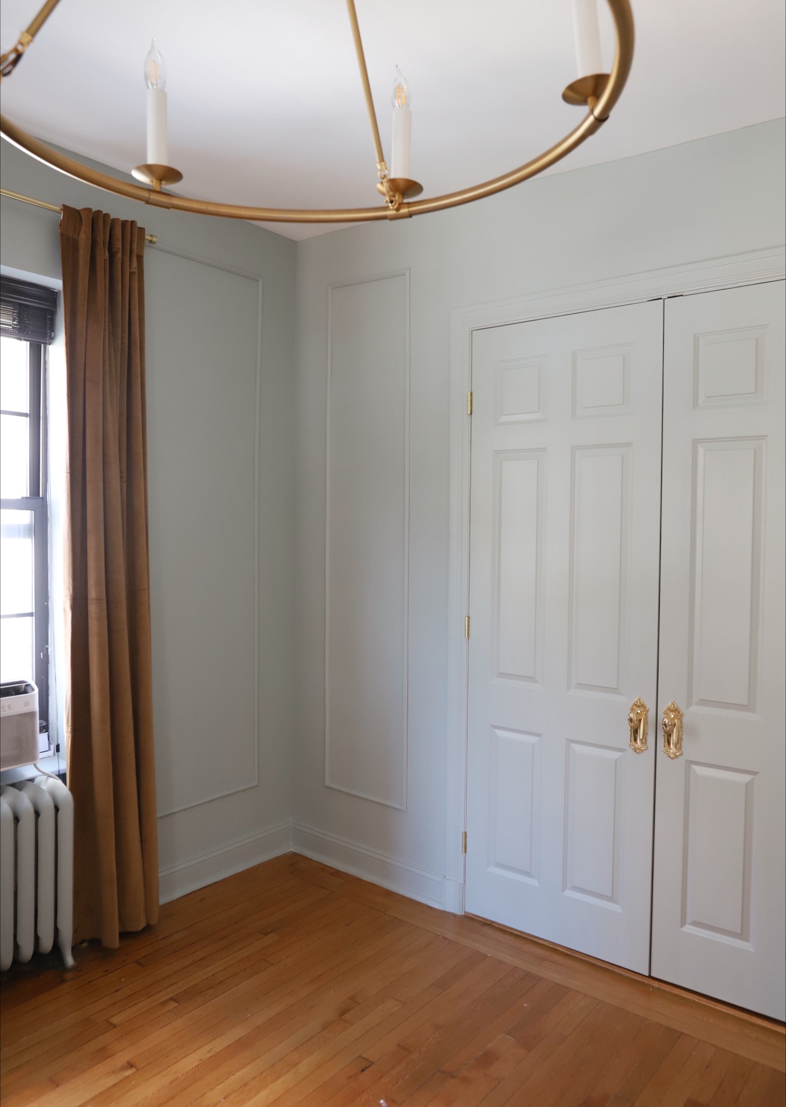
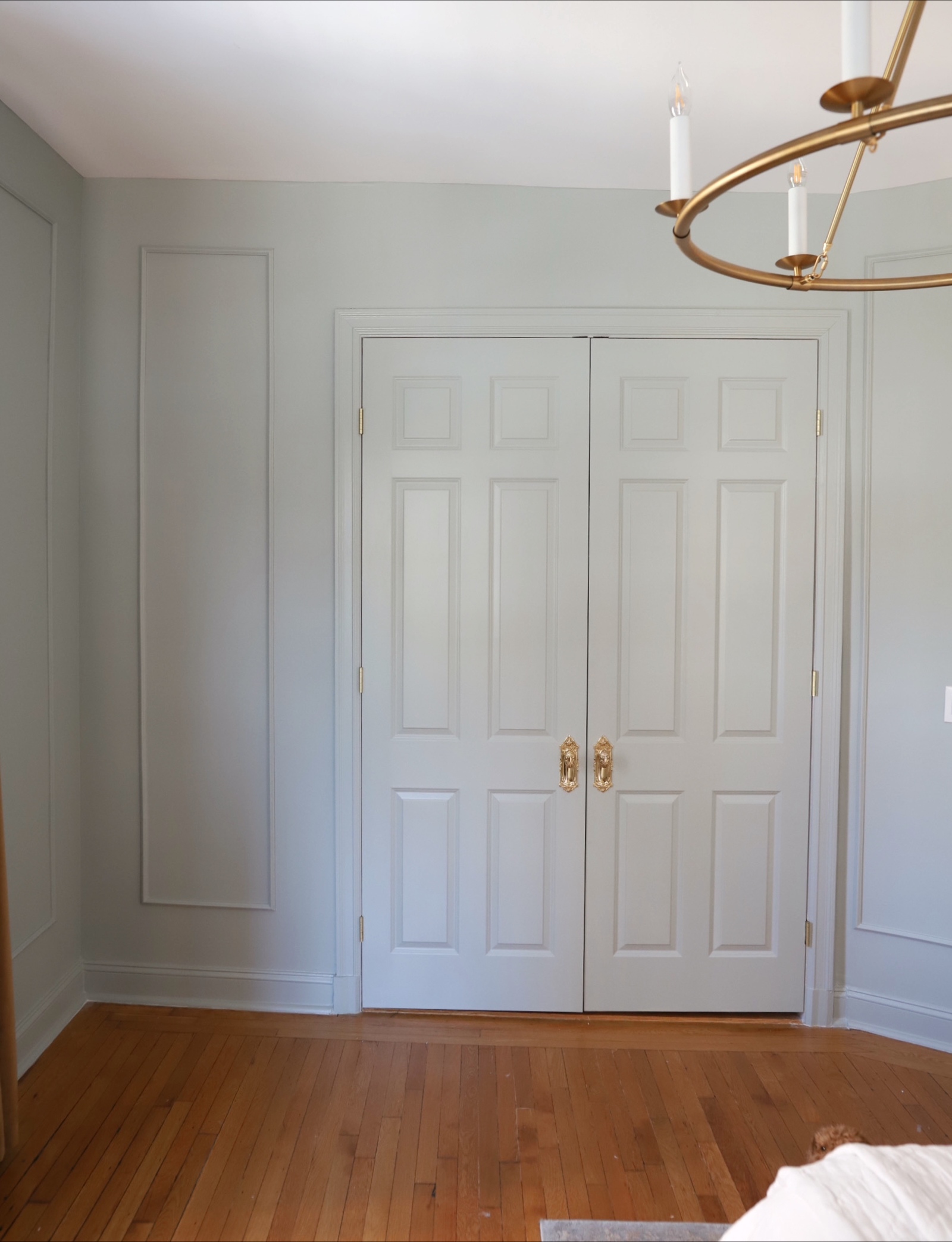
Finishes:
Walls: Modern Emulsion
Doors & Floor Trim: Estate Eggshell
If you’re new to using Farrow & Ball, I’d highly recommend booking a Colour Consultancy with their team. They offer some in-person options, but I left extremely impressed by the virtual conversation as well. It’s not a decision to be taken lightly, and you won’t regret the peace of mind that comes with chatting to a pro.
We are still in progress on this room but this start has me feeling so excited and inspired for the rest of the space to come together! I can’t wait to share more as everything unfolds.
Thank you for the love so far on this project! Below are some beautiful complimentary colors to go with Light Blue:
Today’s post is sponsored by Farrow & Ball – which has been an honor and dream to be apart of!

Hi! I love your home decor , and it is my inspiration for my home. Could you tell me what did you search on pinterest to find the ideas and style like yours ? Is it maybe french home decore?
Thank you! 🙂