If you’ve followed me for a while, you know that I love Nancy Meyers.
Oh, you don’t know her? Allow me to debrief: Nancy Meyers is an iconic American filmmaker who is known for some of my personal favorites like The Parent Trap, The Holiday, It’s Complicated, Something’s Gotta Give, to name a few.
But what she isn’t necessarily widely known for is her unmatched interior design. Every little detail in the homes of her movies have special care and feel more than your typical movie set (re: the English cottage from The Holiday; ugh, what a dreaaaam!) Every little corner’s design is intentional and nothing is left untouched.
And that’s been my dream for quite some time now: to achieve the Nancy Meyers aesthetic.
Nancy Meyers has this ability to effortlessly create a cozy, comforting, and welcoming space. The sets in the homes of her films are deliberate with texture and style. And that is something we’ve wanted to reflect in our home (without Diane Keaton… unfortunately…).
One thing we’ve learned in this content creation world is that copying aesthetics can be easy, but balancing a look and feeling with practicality can actually be a little harder than you’d think. After all, what’s the use in having the kitchen of our rom-com dreams if the way we use the space makes no sense, or if we fail to use products that actually improve our lives? So, with form and function in mind, we recently set out to make some simple changes in our kitchen to feel both classic and purposeful.
We started part one of the changes in our kitchen earlier this week and here are a few things we’ve done so far:
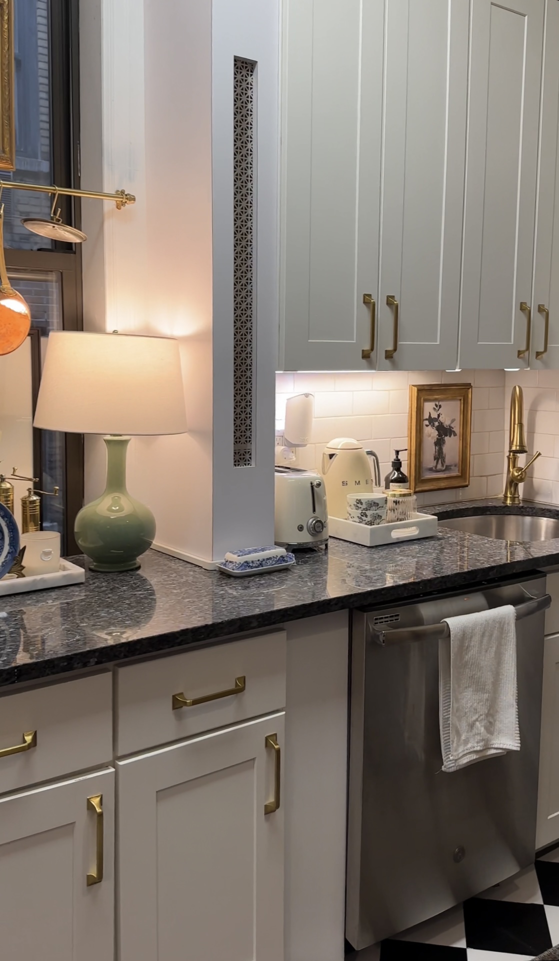
1. We hung an inexpensive frame behind our kitchen sink
There’s something so comforting about a charming picture frame. It can make any space instantly more warm, homey, and more stylish! It also can really pull a vignette together (and depending on the art within the frame, can really make subtle colors stand out)! This frame tied this corner of the room together and immediately made an otherwise strictly practical space more charming.
2. We always keep a lamp on the kitchen counter
While this isn’t new in our space, it’s a small touch that sometimes flies under the radar in our home. Opting for a warmer light source in the kitchen (the alternative for us being really harsh LED overhead lights) makes the space feel more intimate and inviting. (While “intimate” may be common terms for a small kitchen, words like “inviting” aren’t used all that often, so we love being able to create a coziness where people expect something cold.)
3. We added a tray and cannister to tea station
I gathered a few of our most used kitchen appliances (our Smeg tea kettle and mugs) and placed them in a marble tray that created a clean, organized, and aesthetically appealing tea station. Additionally, we bought a gorgeous canister that holds our tea bags. Some simple organization and aesthetic creativity has turned this into a beautiful little vignette. I love how all of our products are not only organized and in one spot, but it is a special corner that brings a smile to my face every time I use it! Can’t ask for much more than that!
4. We placed an antique mini plate under our hand soap bottle
This is such a small addition that made the biggest difference! Typically, with hand soap, we all buy it and just sit it on our counter. And of course, there’s nothing wrong with that, but why not have a little fun and make it intentional and beautiful?! (That’s kinda our mantra over here!) So we turned this marvelous mini plate (which, let’s be real, is sort of impractical as an actual plate) into a place to hold our hand soap. It is another piece that can add a little pizazz to a corner that seems rather drab and boring. (And it also can catch excess soap that leaks out of the nozzle!)
5. We installed puck lights under the cabinet
It’s no accident that we’re focusing on lighting more than once here — you could argue nothing sets the tone for a space quite like light. Our kitchen generally is just
Stay tuned as we continue to add more additions to our kitchen over the next few weeks!
Looking for more inspo or ideas? Shop our kitchen here!
