We — much to our own chagrin — don’t watch a ton of movies anymore. We used to stay updated on the latest and greatest in film, but as we’ve gotten older, we tend to return to old favorites while occasionally taking a recommendation from a friend whose taste we implicitly trust.
What we do find ourselves doing more regularly is binging movie trailers on YouTube — does anyone else do this? It starts with a simple “oh, let’s watch the latest Succession teaser” and 30 minutes later we’ve done a deep dive on every upcoming indie movie, Netflix Rom-Com, and any Ana Taylor Joy project from the last two years. The best part? It kinda feels like you’ve just watched like 18 movies — granted, without all the deep emotion and appreciation for the ~ art of storytelling ~ .
We’ve found ourselves doing the same thing with apartment and decor inspiration lately. Where it’s potentially a normal practice to peruse Pinterest for beautifully decorated rooms or spaces that match our taste, we’ve found ourselves being drawn to the vignettes that make up these breathtaking feats of interior design.
Vignettes, much like movie previews, are shadows of something larger and more grand — but are by no means hollow in nature. Filmmaking is an art, but making a proper teaser requires a delicate hand and a keen eye. It’s the precise and skilled work of a surgeon, as opposed to the brush strokes of a painter instinctively feeling out their own unseen vision.
In your home, placing the couch and tv in the right spot may just be a matter of what feels right or makes you intangibly happy — the Marie Condo effect. However, decorating your media console, bookshelf, or coffee table takes a bit more focus and intention (even if where your couch or tv goes feels more vital to the room as a whole).
Throwing together a handful of books and knickknacks may work for some, but for many it can feel cluttered — in the same way that cutting together random scenes from a movie can either feel exciting, confusing, or completely uninteresting, even if the movie itself is awesome.
While we appreciate the craft of teaser-making and vignette design alike, we admit that neither is rocket science. Still, it’s with great appreciation making the little things feel special that we pay homage to the corners and adornments around our home — and share a bit about how we approach styling these vignettes as well!
We hope this post offers some sense of inspo or instruction for adding those finishing touches to rooms you already love.

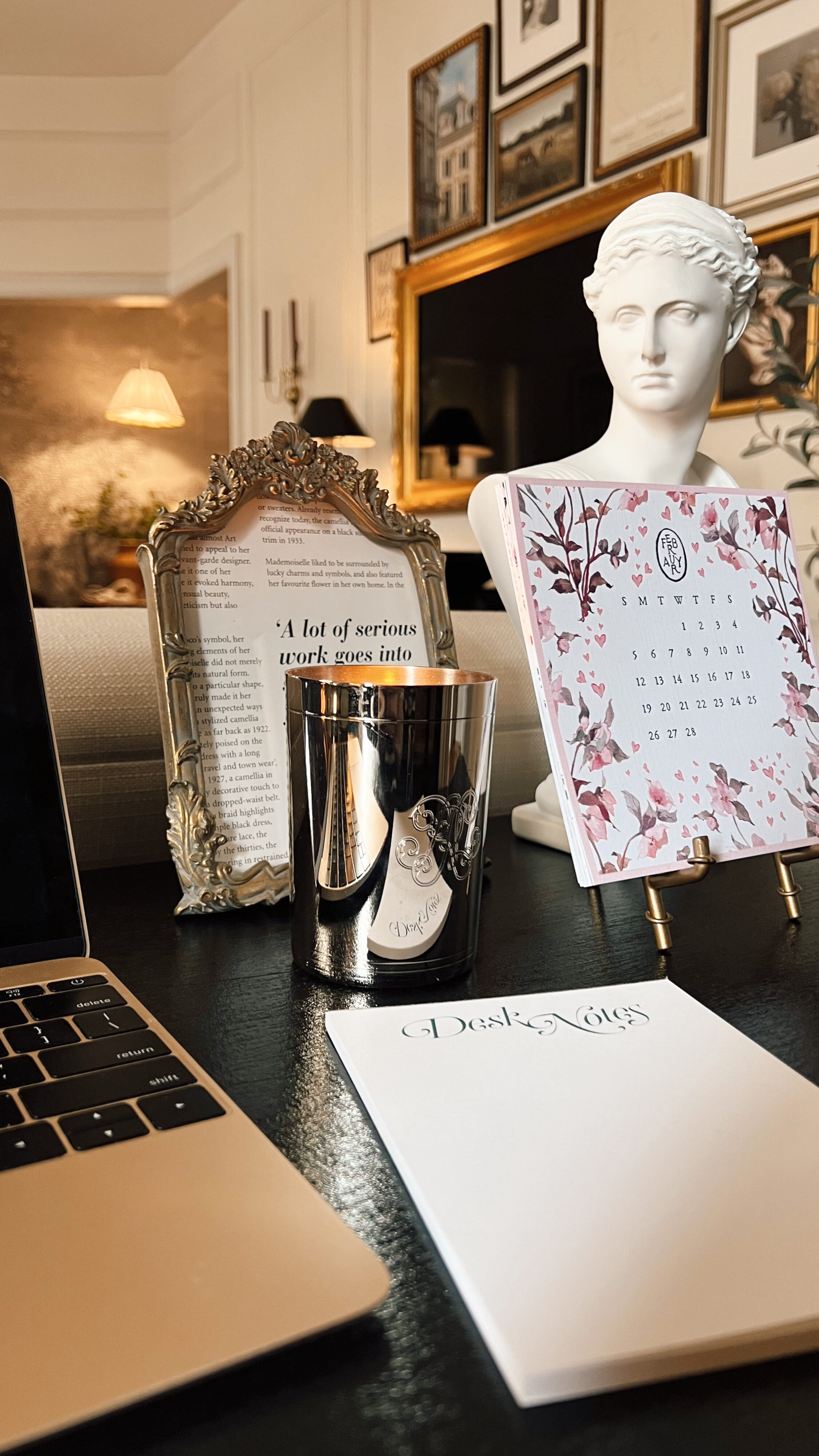
Balance your heights! We always like to have the two tallest items on the far left and far right outside and the smaller items on the inside so it feels like there’s a distinct separation to the vignette. This rule applies whether your vignette is across a large or small space.
Shop Anna’s desk vignette here.

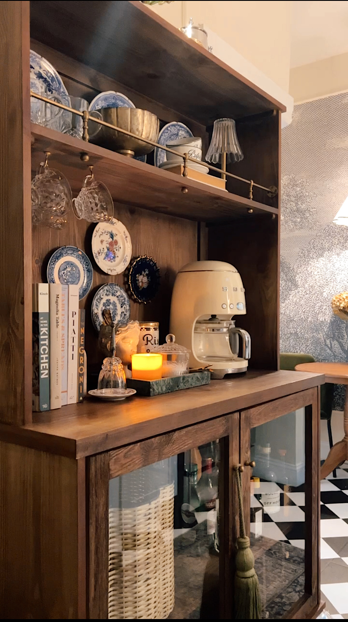
Keep things practical! We don’t love having too many Knick-knacks laying around, so we love when we can add in a piece that’s also practical. Take our coffee bar for example: the small bust vase is a unique piece but is also perfect for storing our stirring spoons (say that 5x fast)!
Shop our kitchen hutch vignette here.

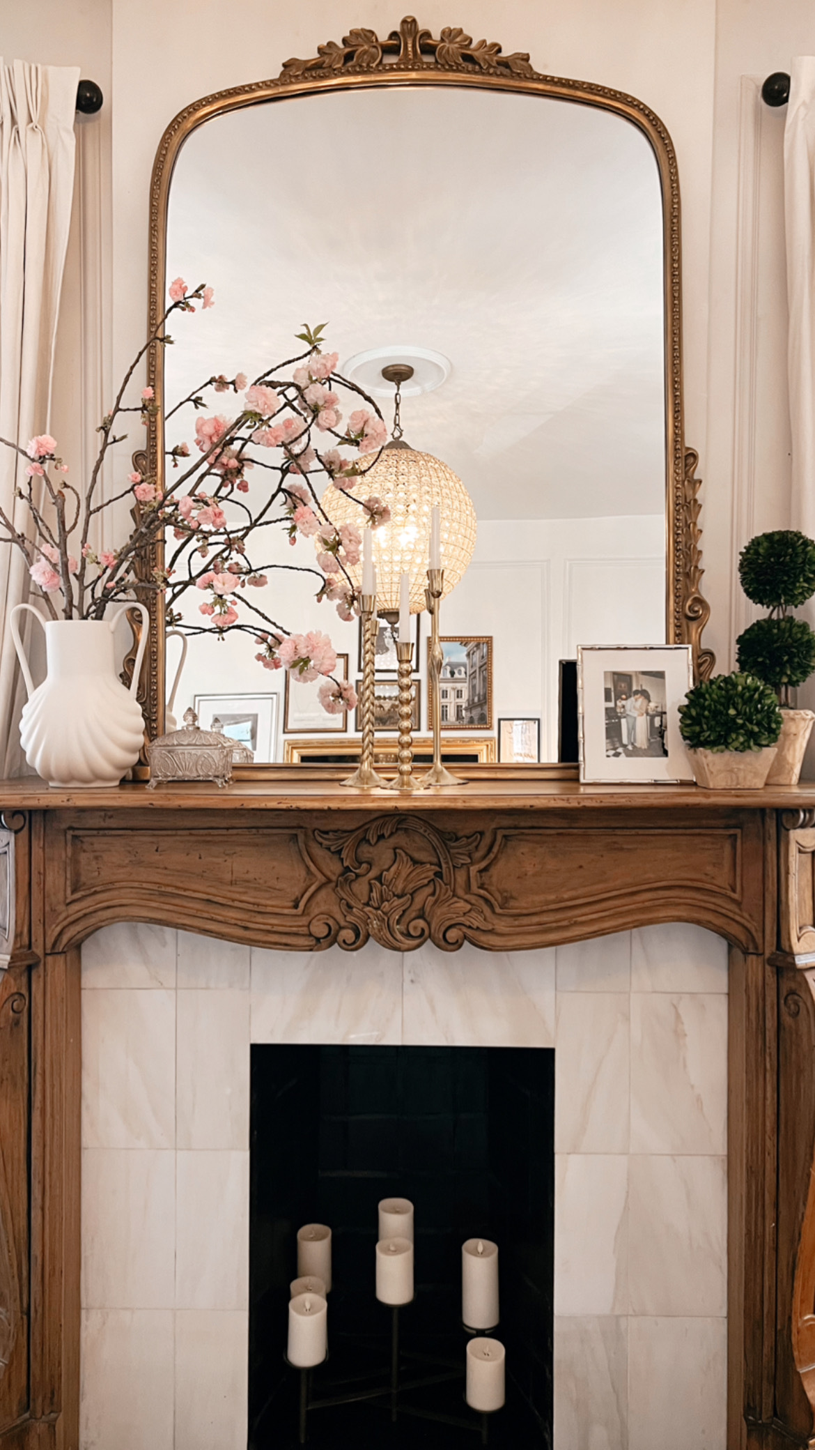
Vary your textures. Faux plants are a great way to add diversity to a vignette so that everything doesn’t look flat. A curvy vase would balance out a linear frame or etched glass can compliment the simple lines of a flower pot!
0
Comments
• leave a comment •