It’s really beautiful when you have a plan for something in life, and then everything goes exactly according to your vision. Every piece fits, every step of the process builds on the one before it, and the end result falls into place exactly how you’d expected. There’s just something so special about a plan coming together.
I would love for every design decision in our home to go like that — you know, “according to plan.” I don’t like surprises, but they happen all too often. You find the piece of furniture that’s perfect, but it’s back-ordered until 2024. You find the ideal paint color, but it shows up darker on the wall than expected. Or, more likely than not, you can’t find the perfect thing — at the right price — or said perfect thing doesn’t fit in your space, or the inspiration just isn’t coming to you the way you hoped.
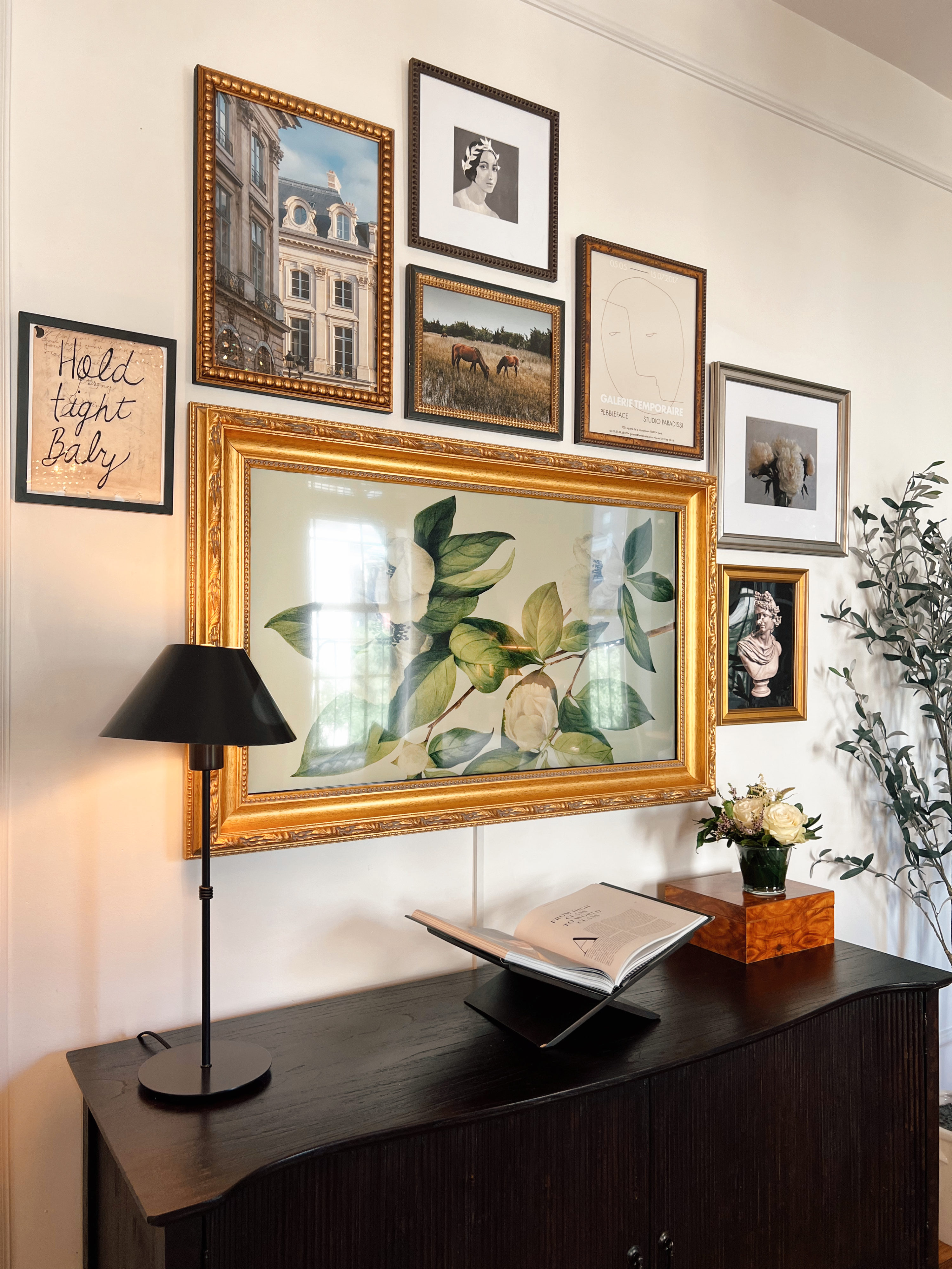
I recently took on a new design project: refreshing our media wall. This time, instead of trying to make the process perfectly organized, I decided to create a loose plan and trust my instincts along the way and live with the results. The starting point was to choose the art that would go in the gallery, and then allow that to guide the design process from there. To find these prints, I partnered with our friends at Artfully Walls. Their collections are beautifully curated in a way that feels organic and uniform instead of being too match-y, which means any pieces you collect from them will feel at home together without overpowering your gallery.
A massive relief when using Artfully Walls is that all of their prints have the option to be framed when you order them. Their frame selections offered enough variety that I didn’t feel the need to do any of that myself — saving me a weirdly arduous and expensive step! As far as a rhyme or reason for which pieces I chose — I wish I had a better answer than…there wasn’t one. First and foremost I went through hundreds of pages (I like having options, ok?) and even checked out some of their collections from other designers. After creating a favorites list longer than the one in my Net-A-Porter app, I started to come up with a process. I wanted to incorporate different elements of things I loved and my “style” while also mixing that in with a variety of art styles.
The horses felt like Ralph Lauren, the photography of Parisian architecture reminds me of our trip last year, the busts… well, we all know the obsession there. From there, adding some abstract prints simply tied in a pop of interest without clashing against the other pieces. Below is an idea of each element I chose and how they ended up working together.
*Shop our new credenza here! (pictured above)*
I added these prints into Canva and got a rough, not-so-to-scale draft of what the layout could look like and the last step was choosing the frames! That seemed like the easy part, especially considering there weren’t any bad options to choose from.
The final step after these pieces arrived was to actually put the gallery wall together. This is where I willfully gave up some portions of my plan and trusted my gut. My focus wasn’t on measuring to make sure everything was perfectly spaced or evenly separated. Instead, I followed my outline loosely and trusted how I felt about the art as I placed it on the wall. The spacing ended up adjusting ever-so-slightly, and I am so happy with the end result!
I hope this post helps add some inspiration for any gallery walls you may be dreaming up in your home! I can’t recommend Artfully Walls’ selection enough, and I would encourage all of you to come up with your plan, and then leave plenty of room to draw outside the lines when the moment comes to bring the design to life!
Today’s post is sponsored by Artfully Walls!
